


Tiffany & Co. Icons Guide
Tiffany & Co. Iconic Silhouettes
Elsa Peretti, Paloma Picasso and the Designs That Changed Modern Tiffany Jewellery_
When most people think of Tiffany & Co., their first mental image may be the Tiffany Blue Box, an engagement ring or the Return to Tiffany heart tag.
Yet some of the House’s most important jewellery designs came from something far quieter: a line, a curve, a recognisable silhouette.
During the second half of the 20th century, Tiffany developed unusually strong relationships with independent designers whose names became inseparable from the House. Two of the most influential were Elsa Peretti and Paloma Picasso.
Their aesthetics could hardly have been more different.
Peretti distilled jewellery down to sensual, organic forms inspired by the human body and nature. Picasso embraced graphic symbols, handwritten lines, exuberant colour and an unmistakably urban energy.
Together, their creations helped expand what “Tiffany jewellery” could mean.
And remarkably, many of their simplest designs remain recognisable decades later.
⸻
Elsa Peretti: The Woman Who Made Simplicity Luxurious
Elsa Peretti joined Tiffany & Co. in 1974, and Tiffany itself describes her arrival as a revolution in jewellery design.
Her first Tiffany collection reportedly sold out on the day it debuted. Perhaps more importantly, her work helped elevate sterling silver into a genuinely fashionable luxury material, at a time when prestige jewellery was still heavily associated with gold, platinum and formal gemstone pieces.
Photo credit: https://cfda.com/news/remembering-elsa-peretti/
Peretti was born in Florence and educated in Rome and Switzerland. She later trained in interior design before establishing herself as a model in New York and Barcelona. By the late 1960s she had begun designing jewellery; her work appeared in Giorgio di Sant’Angelo’s fashion shows, and she became closely associated with designer Halston and the creative world surrounding 1970s New York.
Her jewellery did not resemble conventional fine jewellery of the period.
Instead of concentrating attention on gemstones, Peretti concentrated on form.
Smooth metal became pebble-like. Hearts became fluid voids. Diamonds appeared suspended like droplets. Bracelets followed the actual anatomy of the wrist.
Her philosophy can perhaps be understood through one of her best-known statements:
“Good line and good form are timeless.”
That idea explains why so many Peretti designs remain remarkably contemporary half a century later.
⸻
The Elsa Peretti Bean®
Few jewellery designs could be more ordinary in inspiration than a bean.
And that is precisely why the design matters.
Introduced in the early 1970s, Peretti’s Bean design transformed one of nature’s humblest forms into a polished, tactile piece of jewellery. Tiffany describes the bean as representing the origins of life, while its simple contours and smoothness were qualities that appealed deeply to Peretti.
Look closely and the Bean is not symmetrical in the conventional sense.
It curves inward at its centre, swells gently on either side and sits against the body almost like a small polished stone.
That three-dimensionality is important.
A Bean pendant is not simply a bean outline stamped from a flat sheet of gold or silver. Its identity comes from volume, proportion and surface.
Why the Bean Became Iconic
Its strength lies in its lack of obvious branding.
There are:
- No initials,
- No logos,
- No gemstones required,
- And almost no decorative detail.
Yet the silhouette itself becomes the signature.
The Bean has consequently appeared across numerous scales and interpretations, from miniature gold pendants to larger sterling silver pieces, earrings and other jewellery forms. Tiffany still produces versions of the design today.
From a collector’s perspective, it is a wonderful example of design recognition replacing logo recognition.
⸻
Elsa Peretti Open Heart
The Open Heart is perhaps the perfect demonstration of Peretti’s ability to take a familiar symbol and remove everything unnecessary.
Rather than drawing the conventional symmetrical Valentine heart, Peretti created an asymmetrical, flowing outline with a large negative space at its centre.
The empty space is as important as the metal surrounding it.
That creates an unusually light appearance even when the design is enlarged.
Tiffany continues to describe the Open Heart as one of Peretti’s most celebrated sculptural forms, and it remains among the House’s most recognisable heart designs.
Why it Works
Traditional heart jewellery can easily become overtly romantic or youthful.
Peretti’s version feels different.
The uneven curves make it:
- More sculptural
- More abstract
- And considerably less literal.
A viewer may recognise a heart immediately, yet the piece still functions as an organic metal form.
That duality has helped the Open Heart transcend several generations of jewellery fashion.
⸻
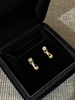
Elsa Peretti Teardrop
The Teardrop belongs to the same family of thinking.
One smooth line.
No excess ornament.
No elaborate setting required.
Yet proportion matters enormously.
A teardrop can appear stiff if the point is too sharp, overly round if the base is too broad or visually heavy if the metal thickness is incorrect.
Peretti’s interpretation is characteristically fluid: the form feels stretched by gravity rather than geometrically drawn.
That sensitivity to natural movement is one of the recurring characteristics of her work.
The Bean seems grown.
The Open Heart seems drawn in one gesture.
The Teardrop appears to have fallen.
Peretti did not merely borrow shapes from nature; she attempted to reproduce their physical behaviour.
⸻
The Bone Cuff: Peretti’s Sculptural Masterpiece
If the Bean demonstrates Peretti’s minimalism, the Bone cuff demonstrates her understanding of the human body.
The design dates to 1970, before her formal arrival at Tiffany.
Peretti drew inspiration partly from childhood visits to a Capuchin crypt in Rome and partly from the organic architecture of Antoni Gaudí. But the most important inspiration is immediately visible: the wrist itself.
The Bone cuff is deliberately asymmetrical.
One side rises over the protruding wrist bone while the remainder wraps closely around the arm.
In fact, Tiffany produces specific left-wrist and right-wrist versions because the anatomy is built into the design.
That is extraordinary when you consider how most bracelets are designed.
Normally, the body must adapt to the jewellery.
With the Bone cuff, the jewellery adapts to the body.
Why the Bone Cuff Matters
It sits somewhere between:
- Jewellery
- Industrial design
- Sculpture
- Anatomy
There is no conventional central motif.
The entire object is the motif.
Its convexities and concavities change dramatically depending on the viewing angle, making it difficult to fully understand from a frontal photograph.
Tiffany notes that the Bone cuff has entered permanent museum collections and remains one of Peretti’s major design icons more than five decades after its creation.
⸻
Why Elsa Peretti Changed Tiffany & Co.
Peretti’s influence went beyond a handful of famous silhouettes.
She changed several assumptions about luxury jewellery.
Sterling silver could be luxurious
Her first Tiffany collection helped turn sterling silver from a comparatively utilitarian material into desirable designer jewellery.
Fine jewellery did not need to be formal
Peretti’s designs were meant to move naturally with everyday clothing rather than wait for an evening occasion.
Diamonds could become casual
Her Diamonds by the Yard® concept placed bezel-set diamonds at intervals along delicate chains, helping popularise the idea of diamonds worn casually rather than reserved for formal settings. Tiffany credits the design with changing the role of diamonds in fashion.
The body could dictate the design
The Bone cuff, Mesh jewellery and other Peretti pieces were conceived around touch, drape and anatomy rather than simply how jewellery appears inside a display case.
This may explain why her creations age unusually well.
They were designed around bodies and natural forms—not trends.
⸻
Paloma Picasso: Tiffany’s Graphic Counterpoint
Six years after Peretti officially joined Tiffany, another radically different creative voice arrived.
Paloma Picasso joined Tiffany & Co. in 1980.
Photo credit: https://www.nytimes.com/2025/04/22/arts/design/picasso-show-paloma.html
The daughter of artists Pablo Picasso and Françoise Gilot, Paloma had grown up surrounded by art. Before Tiffany, she studied jewellery design, created jewellery for Yves Saint Laurent and worked with Greek jewellery house Zolotas.
Tiffany Design Director John Loring initially invited her to create a table setting for a 1979 exhibition.
By the following year, Tiffany had introduced her first exclusive jewellery collection.
Where Peretti’s jewellery felt smooth and elemental, Picasso’s work was often:
graphic, assertive, colourful and symbolic.
Her vocabulary included:
- Xs
- Scribbles
- Zigzags
- Hearts
- Handwritten words
- Bold gemstone combinations
- Botanical motifs
The contrast between the two designers is one of the most fascinating chapters in Tiffany history.
Tiffany did not demand that they both design within one rigid “house style.”
Instead, their individual languages became part of Tiffany’s identity.
⸻
Paloma Picasso Loving Heart
Paloma Picasso’s Loving Heart is another example of a universally recognisable symbol being reimagined through a designer’s handwriting.
Where Peretti’s Open Heart is flowing and organic, Picasso’s Loving Heart is more graphic.
The heart appears to twist and cross into itself, creating a looping motif that can almost resemble an embrace.
It is recognisably romantic without being a conventional outline of a heart.
And this is where comparing the two Tiffany hearts becomes particularly revealing.
Elsa Peretti Open Heart
Sensual
Organic
Asymmetrical
Minimal
Paloma Picasso Loving Heart
Graphic
Looped
Expressive
Almost Calligraphic
⸻⸻
Two designers.
One symbol.
Completely different results.
That diversity is part of what makes Tiffany’s designer archive so interesting.
⸻
Paloma’s Graffiti X
Perhaps no design better captures Paloma Picasso’s arrival at Tiffany than Paloma’s Graffiti.
The collection debuted in 1980 and took inspiration from graffiti appearing across New York City during the 1970s—a form of visual expression that much of polite society then regarded primarily as vandalism.
Picasso’s idea was provocative:
What happens when marks sprayed or scribbled onto city walls are translated into precious metal?
Among the best-known designs is the X.
Tiffany describes it as being based upon Picasso’s own handwriting, with the X simultaneously functioning as a universal symbol for a kiss.
The result was remarkably modern.
Gold no longer needed to imitate lace, flowers or classical ornament.
It could imitate a scribble.
That transformation helped legitimise urban visual language within fine jewellery decades before street culture became thoroughly absorbed by luxury fashion.
⸻
Why the Graffiti Collection Was More Radical Than It Looks Today
To modern eyes, graphic jewellery inspired by graffiti seems almost normal.
In 1980 it was considerably less obvious.
Luxury jewellery historically derived much of its design language from:
- Aristocratic ornament
- Naturalistic flowers
- Architectural motifs
- Art Deco geometry
- Or gemstones themselves.
Picasso instead looked to New York walls and subway culture.
She took something ephemeral, rebellious and popularly regarded as undesirable and recreated it in precious gold.
Tiffany itself describes the collection as having helped turn an urban street-art language into something covetable.
That conceptual inversion is probably one reason the Graffiti collection remains relevant.
⸻
Paloma Picasso Olive Leaf
Decades after her first Tiffany collection, Picasso demonstrated another side of her design language.
The Olive Leaf collection was introduced in 2013.
It was inspired by the olive groves surrounding her home in Marrakesh and by the olive branch’s long-standing associations with peace and harmony.
The collection is recognisably botanical, yet it avoids simply reproducing a leaf realistically.
Small leaves form rhythmic branches that curve around necklaces, rings, bracelets and earrings.
Depending on the execution, diamonds can turn the leaves into points of light while plain-metal versions emphasise the branching silhouette.
Why Olive Leaf is Interesting Within Picasso’s Career
At first glance, Graffiti X and Olive Leaf seem unrelated.
One comes from urban New York.
The other from nature in Marrakesh.
But both reveal Picasso’s fascination with meaningful symbols.
An X becomes a kiss.
A scribble becomes jewellery.
An olive branch becomes a talisman for peace.
Her jewellery frequently communicates something beyond decoration.
⸻
Paloma Picasso and Colour
Although this guide focuses on silhouettes, colour deserves mention because it is fundamental to Picasso’s contribution to Tiffany.
Tiffany credits her with helping champion the bold coloured-gemstone aesthetic of the 1980s. Picasso has recalled being shown Tiffany’s gemstone inventory and becoming fascinated by stones whose intense colours were then comparatively overlooked by much of the industry.
Her work frequently juxtaposed:
- Strong yellow gold
- Richly coloured gemstones
- Bold scale
- Graphic geometry
That was the opposite of quiet minimalism.
Yet it gave Tiffany another enduring design vocabulary.
Two of Picasso’s extraordinary gemstone creations have entered American museum collections: a 396.30-carat kunzite necklace at the Smithsonian Institution’s National Museum of Natural History and a 408.63-carat moonstone bracelet at Chicago’s Field Museum of Natural History.
⸻
Why These Older Tiffany Designs Matter Today
Modern luxury increasingly relies upon immediately recognisable motifs.
Peretti and Picasso demonstrate an earlier—and arguably more difficult—route to recognition.
The silhouette itself becomes intellectual property.
A tiny Bean pendant can be recognisable across a room.
The upward curve of a Bone cuff tells an informed collector exactly what it is.
A loosely scripted X can immediately suggest Paloma Picasso.
That kind of visual recognition is exceptionally difficult to create because it depends on design strength rather than branding surface area.
It also explains why many pieces created in the 1970s and 1980s can sit beside contemporary jewellery without appearing obviously vintage.
⸻
An Interesting Tiffany Fact: The Designer’s Name Matters
Tiffany’s relationship with Peretti and Picasso is unusual in the luxury jewellery world because their individual identities remained highly visible.
These are not merely:
“Tiffany Bean” or “Tiffany Bone Cuff.”
They are:
Elsa Peretti® Bean design
Elsa Peretti® Bone cuff
Paloma Picasso® Loving Heart
Paloma’s Graffiti
That authorship matters.
The designer is part of the provenance.
For collectors, understanding which creative mind produced a Tiffany silhouette adds another layer of context to a piece that might otherwise appear deceptively simple.
⸻
What Should Collectors Look For in Vintage Tiffany Designer Pieces?
Older Peretti and Picasso jewellery deserves assessment in much the same way as other signed designer jewellery.
Collectors should consider:
- Correct Tiffany & Co. and designer signatures
- Metal hallmarks
- Proportions of the motif
- Condition of polished surfaces
- Chain originality where relevant
With highly sculptural Peretti jewellery in particular, condition can materially affect appearance.
A Bean or Bone cuff derives much of its beauty from precise curvature and polished surfaces. Heavy dents or aggressive refinishing may therefore change the character of the design more noticeably than wear on heavily ornamented jewellery.
⸻
WLC Curator’s House Note
Tiffany & Co. is sometimes reduced to a handful of very obvious symbols: Tiffany Blue, engagement diamonds and heart tags.
We think that undersells one of the most interesting aspects of the House.
Tiffany has historically been remarkably good at giving individual designers enough freedom to create objects that still look unmistakably like themselves.
Elsa Peretti’s pieces are some of the finest examples of how little jewellery actually needs in order to become iconic. A bean. A droplet. A hollow heart. The contour of a wrist bone. Her work is quiet enough to wear every day, yet distinctive enough that the silhouette has survived for more than half a century.
Paloma Picasso approaches Tiffany from almost the opposite direction. Her jewellery feels written rather than sculpted—Xs, hearts, scribbles and branches transformed into precious objects. Even her simplest creations contain a sense of personality.
For collectors, that distinction is part of the pleasure.
One does not necessarily choose between Tiffany designs according to which is more valuable or conspicuous.
Sometimes you are simply deciding:
Do I want jewellery that feels sculpted from nature—or jewellery that feels drawn by hand?
Peretti and Picasso gave Tiffany both.
And that is why these seemingly simple silhouettes remain among the most important designs in the House’s modern history.
⸻
Quick Collector FAQ
Who designed Tiffany’s Bean necklace?
The Bean design was created by Elsa Peretti and introduced in the early 1970s. Tiffany describes the Bean as symbolising the origins of life.
When did Elsa Peretti join Tiffany & Co.?
Peretti officially joined Tiffany in 1974. Her first collection sold out on debut and helped elevate sterling silver within luxury jewellery.
Who designed Tiffany’s Open Heart?
The Open Heart is an Elsa Peretti design and remains one of her most recognisable sculptural motifs.
Why are there left and right Elsa Peretti Bone cuffs?
Because the cuff is sculpted specifically around the anatomy of each wrist. The pronounced curve is designed to accommodate the wrist bone, so Tiffany makes right- and left-wrist versions.
When did Paloma Picasso join Tiffany?
Her first exclusive Tiffany jewellery collection launched in 1980 after she had been invited by Tiffany Design Director John Loring to participate in an exhibition the previous year.
What inspired Paloma Picasso’s Graffiti collection?
Graffiti on New York City buildings during the 1970s. Picasso translated handwritten marks and street-art imagery into precious jewellery.
What does Paloma Picasso’s X represent?
Tiffany describes the X as derived from Picasso’s handwriting and as a universal symbol for a kiss.
What inspired the Olive Leaf collection?
Picasso introduced it in 2013, inspired by olive trees surrounding her Marrakesh home and the olive branch’s symbolism of peace and harmony.
⸻
Available Tiffany & Co. Jewellery :
https://www.welovecuratingsg.com/tiffany-co




.jpeg)


